Tuesday, April 17, 2012

Tones on Tuesday #30 4.17.12

Welcome back and thank you for coming and joining in despite a brief hiatus last week to find my photography inspiration once again. Many beautiful entries from two weeks ago, but here are 3 that caught my eye...

Mock-Turtle from Jack's Paper Moon
Love the expression and the eyes, adorable! The colors are bright and fabulous as well. Thank you for sharing with us Mock-Turtle! The other photos of Jack and of the dog are super cute too :o).

The concept of this shot is so strong! The long exposure of the light and the black and white background gives such a sense of motion. Thank you for linking up Rebecca!

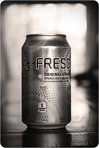
The drama of the black and white is amazing and I love how it takes an ordinary object to a different level. Beautiful bokeh in the background as well. Thank you for sharing Nessa!

Mock-Turtle, Rebecca, Nessa please go HERE to grab your showcase button.

Now it's your turn to share your photo with altered tones. Here are the guidelines for Tones on Tuesday:
  • The basic idea is to share one photo where you have altered the tones. Such as a black and white, sepia toned, selective coloring or colored photo. Feel free to share the original and edit, or just the edit.
  • Please share a photo that you have taken and edited yourself.
  • One photo per photographer please. If you have more than one photo in your post please indicate which one if for Tones on Tuesday.
  • Please link up with your permalink and not your blog address.
  • Attach the Tones on Tuesday button or a link back here to your post
  • Leave comments for at least 3 other participants, share the love :o)!
  • Have fun!
Disclaimer - By participating you give Scattered Horizons permission to share your photo on this blog. Photographers will be given credit for their work.

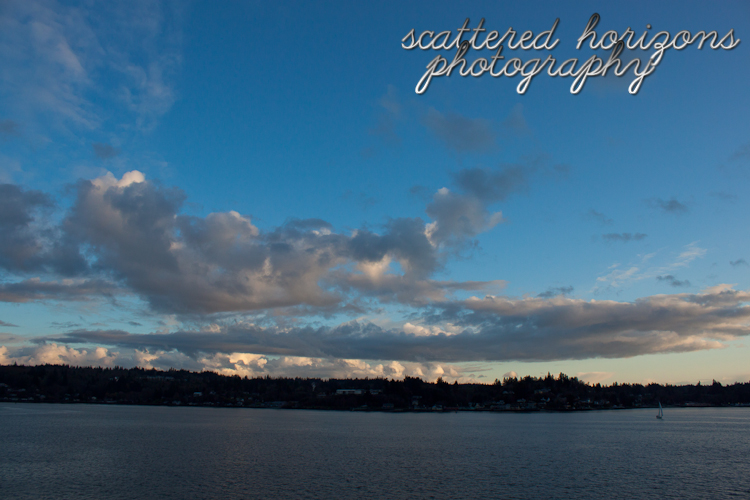
I took a little break from blogging as I was getting in a rut and feeling uninspired. The break helped and then I went to one of my favorite parks in Lincoln City on Siletz Bay to photograph my favorite subject - sunsets and silhouettes. It was a perfect experience and it reminded me that capturing the magic of nature is why I love photography. For the first edit I did a clean edit in Lightroom with the basic settings and the tone curve and then applied Pretty Presets Sharpening. For the second edit I used the Who Is Wolf BW Deluxe Light Preset. I love the vibrancy of the first and the drama of the second, what do you think?

Settings: ISO 200, 18mm, ss1/50, f/11

"Travel is like a tonic to me. It's more than just getting away from the studio for a brief rest. I need it to recharge my batteries." -Norman Rockwell

Joining the link ups below. Be sure to check out the beautiful shots and join the Tones on Tuesday link up found further down!


 Sweet Shot Day  Live, Love, Travel     and then, she {snapped} 


Monday, April 2, 2012

Tones on Tuesday #29 4.3.12

I apologize for the lateness in visiting and commenting on your photos. I was not feeling well this past week and the worst of it was this weekend. Despite that, seeing your photos and have the privilege to host this link up is always a highlight of my week! Thank you for coming on this journey with me! Without further ado, the showcases from last week...

Lisa at With Words: Lisa Gordon Photography
Lisa hosted a fabulous link up called The Creative Exchange that she unfortunately had to put on hold for a while. I was sad to see the link up end, but excited to see that Lisa is still photographing and sharing her work with us. I love the timeless, soft feel of black and white and the glow of it. What a beautiful capture! Thank you for sharing with us Lisa.

The bright pink is stunning and I love how it contrasts with the soft processing and texture. There is also a nostalgic feel to the photo that conjures up images of a bouquet from the past. Beautiful job Amy, thank you for linking up!

Creamy black and white tones, soft texture and a beautiful subject make for a great photo! A great story regarding this feline supervisor just add to the adorable photo. Thank you for sharing Nancy!

Lisa, Amy and Nancy please go HERE to grab your showcase button.

Now it's your turn to share your photo with altered tones. Here are the guidelines for Tones on Tuesday:
  • The basic idea is to share one photo where you have altered the tones. Such as a black and white, sepia toned, selective coloring or colored photo. Feel free to share the original and edit, or just the edit.
  • Please share a photo that you have taken and edited yourself.
  • One photo per photographer please. If you have more than one photo in your post please indicate which one if for Tones on Tuesday.
  • Please link up with your permalink and not your blog address.
  • Attach the Tones on Tuesday button or a link back here to your post
  • Leave comments for at least 3 other participants, share the love :o)!
  • Have fun!
Disclaimer - By participating you give Scattered Horizons permission to share your photo on this blog. Photographers will be given credit for their work.

I am going to continue with my photos from two weekends ago as I have only posted one and I didn't get out to shoot this weekend due to feeling under the weather. I am still working to find that elusive balance between photography, work and my personal life. Instead of beating myself up about it, though, I am going to cut back on my posting and try to alleviate a bit of the pressure I have placed on myself. My goal with this blog as always been to become a better photographer and to learn from the many talented photographers I have the pleasure of interacting with through their blogs. With that in mind, I think keeping my joy and reducing my stress is important. 

Now, for the my photo this week...
For this photo I again used the zone system that I wrote about last week. In this case, I metered off the sky and then put it in Zone VI or overexposed by one stop. Again, this tutorial does a much better job of explaining it than I did. Here is the SOOC photo:

Settings: ISO 200, 50mm, ss1/1250, f/5.6 (cloudy wb)
Intent: The vastness of the field and the contrast between the yellow and blue

I liked the balance of colors, but they were sort of blah. So I did a clean edit in Lightroom with the basic settings and then moved to Photoshop to use the Content Aware fill feature to remove the houses in the background as I felt they were a bit distracting. I then ran Pioneer Woman's Lovely and Ethereal and Oh So Posh Actions I Dream in Color actions. What do you think? 

Edit - Lightroom and Photoshop
Intent: Make the colors pop and give it a bit of a vintage feel
“A host of golden daffodils; Beside the lake, beneath the trees, Fluttering and dancing in the breeze.” - William Wordsworth

Joining the link ups below. Be sure to check out the beautiful shots and join the Tones on Tuesday link up found further down!

 Sweet Shot Day  Live, Love, Travel     and then, she {snapped} 


Monday, March 26, 2012

Tones on Tuesday #28 3.27.12

I know I say this almost every week, but thank you for linking up and for inspiring me with your talent and your journey. I am honored that you choose to join me on Tuesday and share your photos! It was very difficult to choose three photos, but I would not have it any other way :o). Now to the showcases...

Nicky at Awesomeville
My first thought upon seeing this photo was that it was breathtaking! The colors are exquisite, the light extraordinary and the mood ethereal. Thank you for sharing this amazing photo Nicky!

The black and white tones, along with the texture, are soft and timeless. The staging and quote (from my favorite movie) tell such a great story. Thank you for linking up Ansku!

Ashley at Ashley Hauck Photography
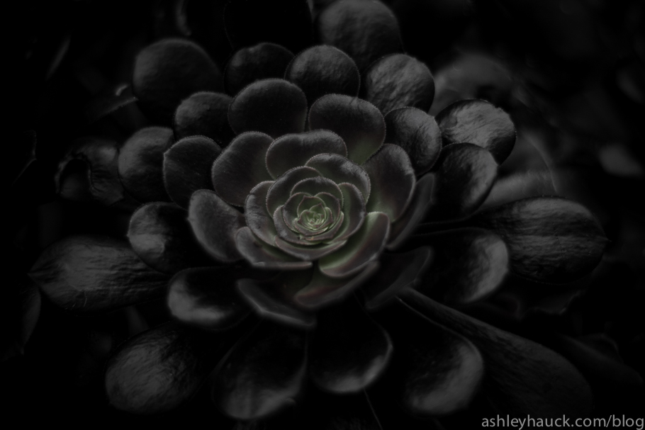
I love the dramatic feel of this photo and the deep tones. The texture of the petals and the hint of green just add to this gorgeous photo! Thank you for sharing with us Ashley. 

Nicky, Ansku and Ashley please go HERE to grab your showcase button.


Now it's your turn to share your photo with altered tones. Here are the guidelines for Tones on Tuesday:
  • The basic idea is to share one photo where you have altered the tones. Such as a black and white, sepia toned, selective coloring or colored photo. Feel free to share the original and edit, or just the edit.
  • Please share a photo that you have taken and edited yourself.
  • One photo per photographer please. If you have more than one photo in your post please indicate which one if for Tones on Tuesday.
  • Please link up with your permalink and not your blog address.
  • Attach the Tones on Tuesday button or a link back here to your post
  • Leave comments for at least 3 other participants, share the love :o)!
  • Have fun!
Disclaimer - By participating you give Scattered Horizons permission to share your photo on this blog. Photographers will be given credit for their work.

This photo was completely inspired by Melissa Noste at Melissa Noste Photography and her post on the daffodil fields and the zone system. 

After reading Melissa's post that the daffodils were blooming up north of where I live I knew I had to head up there and get a taste of spring. I love the amazing bright yellow of the flower against the deep greens. I love the shape of it and its petals. And I LOVE seeing a sea of flowers. There is something so magical about it. I was also intrigued by the zone system. I spent the drive up north reading the tutorial Melissa recommended, which can be found HERE. This system was developed by Ansel Adams and Fred Archer for black and white sheet film and has been adapted for use with digital photography. For me, it boils down to focusing on capturing colors as true to life as possible. The tutorial does an amazing job of explaining the technique and what it means in practice. 

In the photo below I metered off the yellow of the daffodil and put it in Zone VI, which is used for brighter colors such as pure yellow. This means I overexposed by 1 stop (+1). A more detailed explanation can be found in the tutorial. I was so excited by the SOOC result, the yellow was so close to what it looked like and that is one of the things I strive for when I photograph. I by no means understand the system well, but I am interested and intrigued and want to try more!

I love that I learn so much from other photographers and have the chance to try things out with my camera. I enjoy the journey of learning something new and I am so glad that Melissa shared her journey on her blog! Being inspired by fellow photographers is one of my greatest joys. 

Settings: ISO 200, 50mm, ss1/1250, f/3.2 (cloudy wb, Zone VI)
Intent: The shape and details of the daffodil
SOOC Shot

Lightroom Clean Edit
Upped blacks, brightness, contrast, clarity, vibrance and saturation
Decreased lights, darks and shadows using the tone curve
Intent: To make the colors pop a bit
"Inspiration doesn't really work like that - you're not looking out for it. Inspiration is something that tends to capture you rather than you capture it." - Joan Armatrading


Joining the link ups below. Be sure to check out the beautiful shots and join the Tones on Tuesday link up found further down! Share inspiration and be inspired!


 Sweet Shot Day  Live, Love, Travel   
  and then, she {snapped} 

Saturday, March 24, 2012

Vast 3.18.12

The theme this week at Mortal Muses is "I am." This is the sort of question that could have many different answers and all of them would be accurate. I am a daughter, a sister, a friend. I am a teacher and a learner. I am a photographer. I am a perfectionist. I am a hardworker. I am loyal and caring. I am simply me. 

As the quote below says so beautifully, all I can do each and every day is be the best me I can be. From there I am but a small boat in the vast ocean that is the universe.

Settings: ISO 200, 18mm, ss1/400, f/7.1 (SOOC)
Intent: The vastness of being on the ocean and the amazing sky

Lightroom Clean Edit
Intent: Make the colors pop 
(removed spots and adjusted basic settings and tone curve)
"There is only one thing for us to do, and that is to do our level best right where we are every day of our lives; To use our best judgment, and then to trust the rest to that Power which holds the forces of the universe in his hands." - Orison Swett Marden


SOOC Saturday  Scenic Sunday  

Friday, March 23, 2012

Favorite Photo of the Week: A Shell on the Shore 3.18.12

At first I was going to choose one of sunset photos I took this past weekend. You can see them here or here. However, when getting ready to post there was just something about the photo I took on the rocky beach at Kitsap Memorial Park. The colors and the texture just seemed to pull me in. Originally I did a clean edit in Lightroom. For this one I also cropped it a bit. The quote I have chosen to go with this photo perfectly captures my feelings toward photography. I continue to run into obstacles, yet my passion and desire to become a better photographer supersedes them. This photo took a few tries and edits to get the texture and light I wanted, but I had to persist. When you have the hunger you have no choice :o). 

I would love to know your thoughts! Thanks for stopping by! 

On a side note, are you planning on seeing The Hunger Games this weekend? I read the books a long time ago and I am pretty excited for the movie. I think the quote applies to that story as well!

Settings: ISO 200, 50mm, ss1/4000, f/2.0 (cloudy wb)
Intent: The texture of the shell and the color of the rocks
"Wanting something is not enough. You must hunger for it. Your motivation must be absolutely compelling in order to overcome the obstacles that will invariably come your way." - Les Brown


Happily Mother After the long road      project 52 p52 weekly photo challenge my3boybarians.com Weekly Top Shot